Campus safety app empowering Boston University pedestrians with real-time crossing alerts and user-submitted hazard reports
ROLE
Product Designer
COLLABORATORS
Rithvik Doshi (Developer)
Max Higa (Developer)
Kit Yan (Developer)
TIMELINE
Sep 2023 - May 2024
DISCIPLINES
Visual Design
User Research
Prototyping
THE CHALLENGE
78% of Americans admit to jaywalking (YouGov)
With streets so dense, we still see BU students jaywalking or getting distracted when crossing streets, why?
RESEARCH AND USER INTERVIEWS
Debunking why BU students jaywalk or get distracted while crossing intersections
To identify opportunities of where we can help, our team focused on user job mapping, user interviews (20), and conducting competitive audits.
☝️
Users like to press on the pedestrian button to feel like they are making the light turn green faster
🚨
Users are more focused of their surroundings when there is noise
🚔
People aren't fazed by jaywalking or having near accidents
📱
Pedestrians get distracted by their phones
🎧
Pedestrians may listen to music, preventing them from hearing traffic
⛑
There needs a bigger incentive than staying safe
HMW
How might we remind users to stay alert and aware of their surroundings?
THE SOLUTION
SafeSteps helps distracted students and pedestrians who want to cross BU campus safely by providing discreet, location-based alerts as they approach high-density road intersections.
User Onboarding
View Reports Near You
Choosing Alerts
Submitting a Report
DESIGN DECISIONS
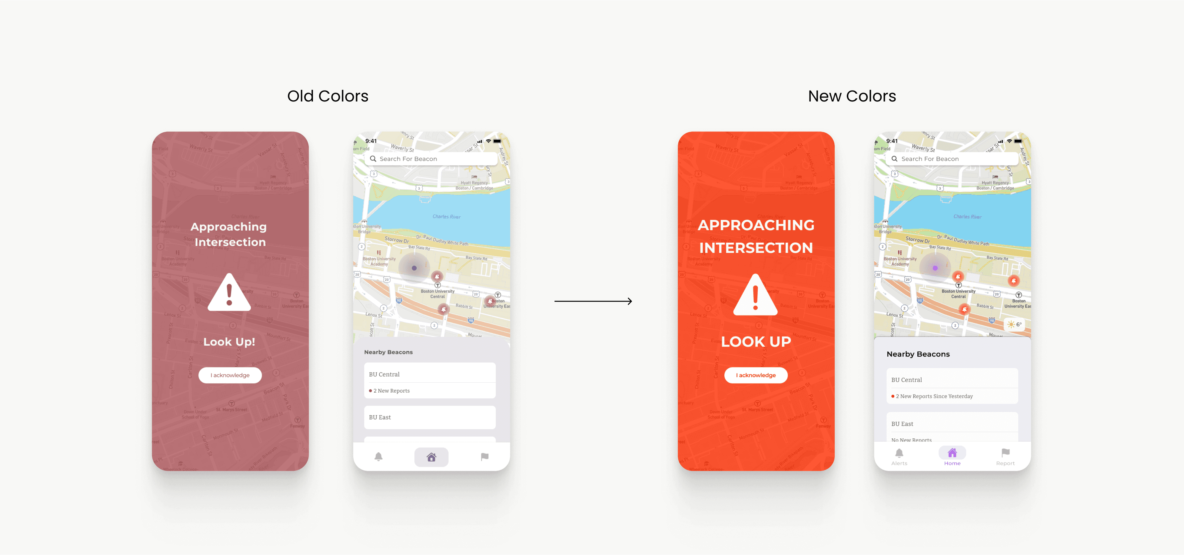
Utilizing a bright color scheme
We realized that a discreet, not-so in your face color scheme didn't reflect upon the identity of our application goals.
DESIGN DECISIONS
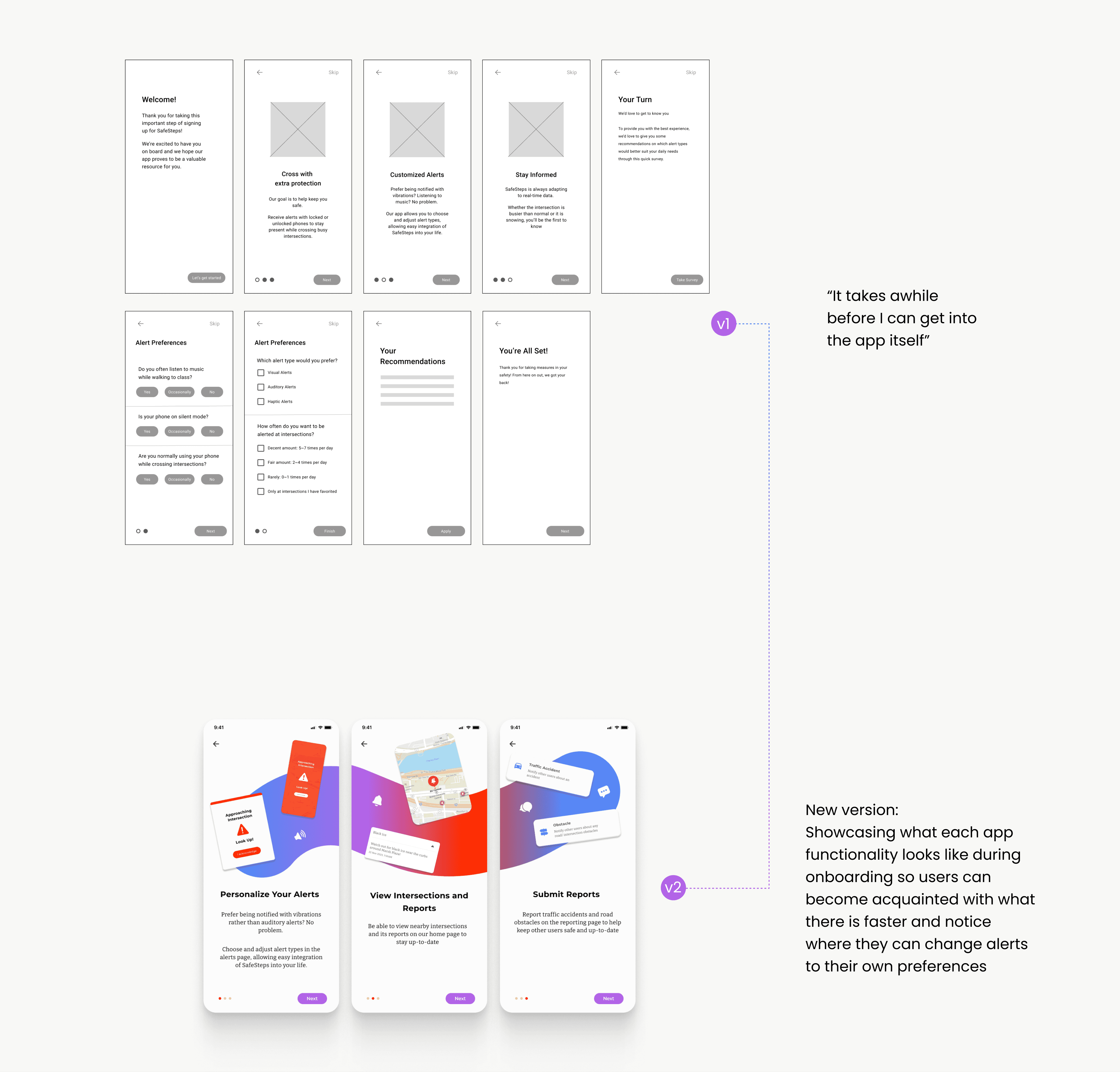
Shorter onboarding
I wanted to tailor alerts based on a user's habits but quickly found that the onboarding process would be too lengthy.
DESIGN DECISIONS
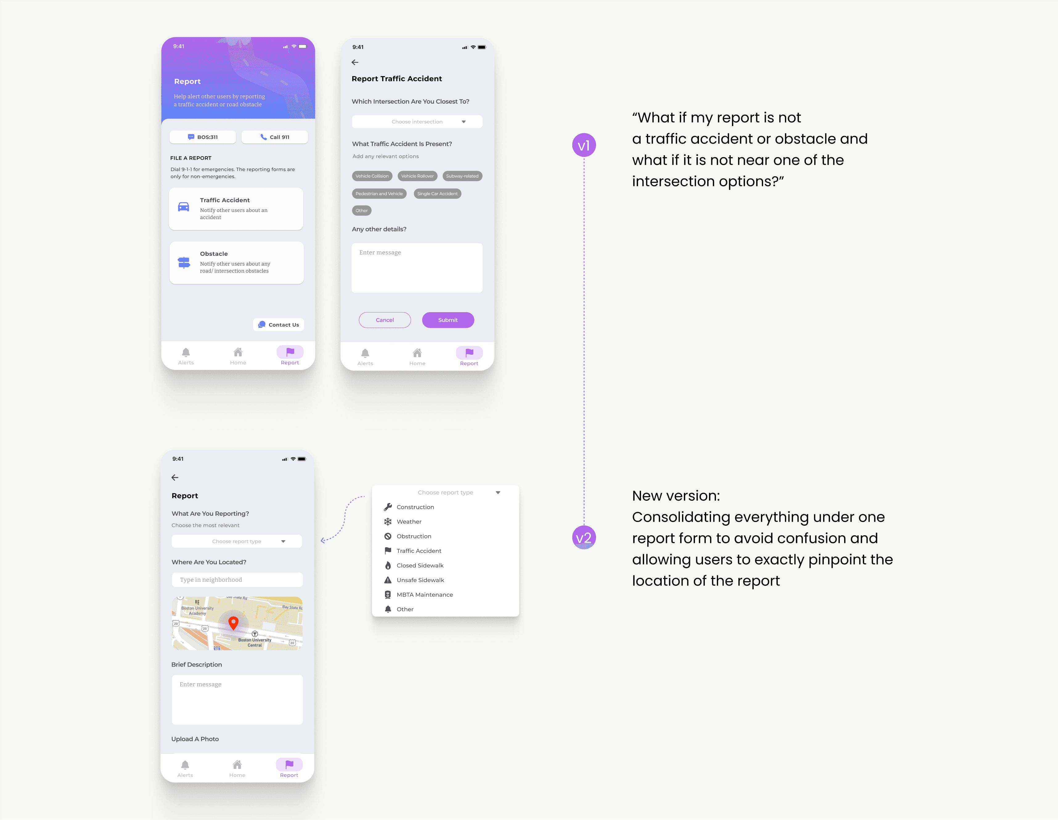
Adding location-based reports
Since jaywalking is just one of many safety hazards, we implemented location-based alerts to help users stay aware of their surroundings, whether they're crossing the street or simply moving through campus.
TAKEAWAYS
To be completely honest, when concluding this particular project it felt bittersweet. I had so much fun developing SafeSteps from start to finish with my team. While we were faced with many challenges, such as figuring the purpose of our application or trying to perfect the design when developing it, ultimately we battled everything together as a team which made the project fun and exciting.
Some more thoughts...
🧠 Seeing how developers and designers think differently
It was definitely a learning experience when developers gave me feedback. One on hand they trusted me and did not want to question my designs, but on the other hand they suggested iterations based on the feasibility of implementing functions. I realized that it was important to keep in mind what the user wanted and championed this idea by constantly asking for feedback from usability interviews
I know that in general I still have SO MUCH to learn, I'm excited to embark on new projects that allow me to better identify how to wireframe, conduct user interviews, and communicate with the team


