
A website redesign to help identify bad landlords within Boston for a new city ordinance
During summer of 2023, I worked in a team with the City of Boston's Policy Director through Boston University's Spark! summer internship to make a website to track for property violations and a matrix to determine if a landlord is a bad landlord (also called a "Scofflaw" property owner)
ROLE
Product Designer
TEAM
Jennifer Liu
Jason Zhang
Christol Yu
TIMELINE
Jun~Aug 2023
DISCIPLINES
Visual Design
Research
Prototyping
The Challenge
The current website is hard to navigate and understand
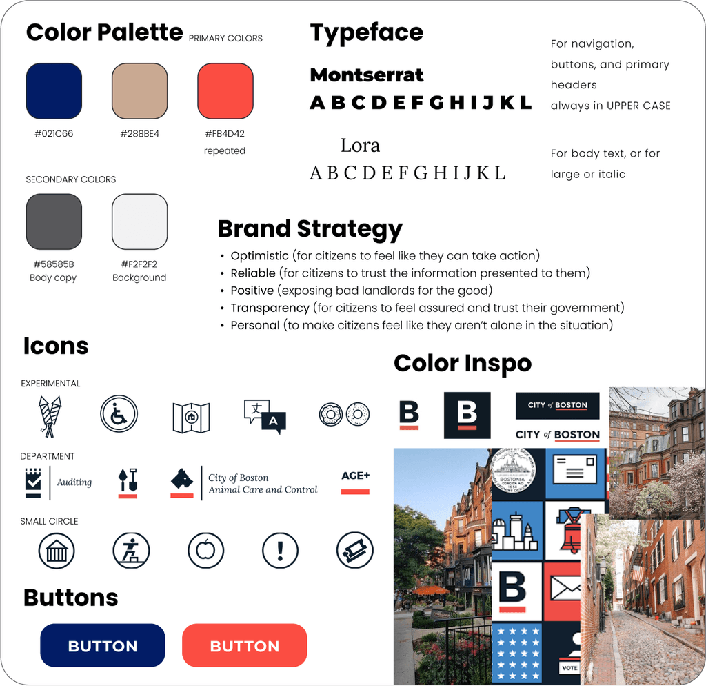
Style Guide? First? Now?
Starting out, I wanted to get a feel of the style of the website to be.
I had to determine how closely we wanted to keep our style to the City of Boston site or with the site of the Councilor in charge of the initiative (Councilor Breadon).
Researching other similar sites
and city data infographics
The purpose of my research was to see functionalities already present that could be builded upon on our site, and grasp good ways to display large amounts of data.
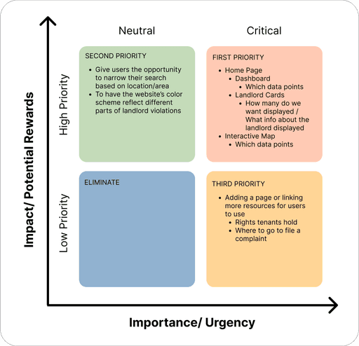
Taking into account my findings and what our project goals were, I created a prioritization matrix for me and the team to help visualize the areas that needed focusing on.
Sketches + Lofi Wireframes
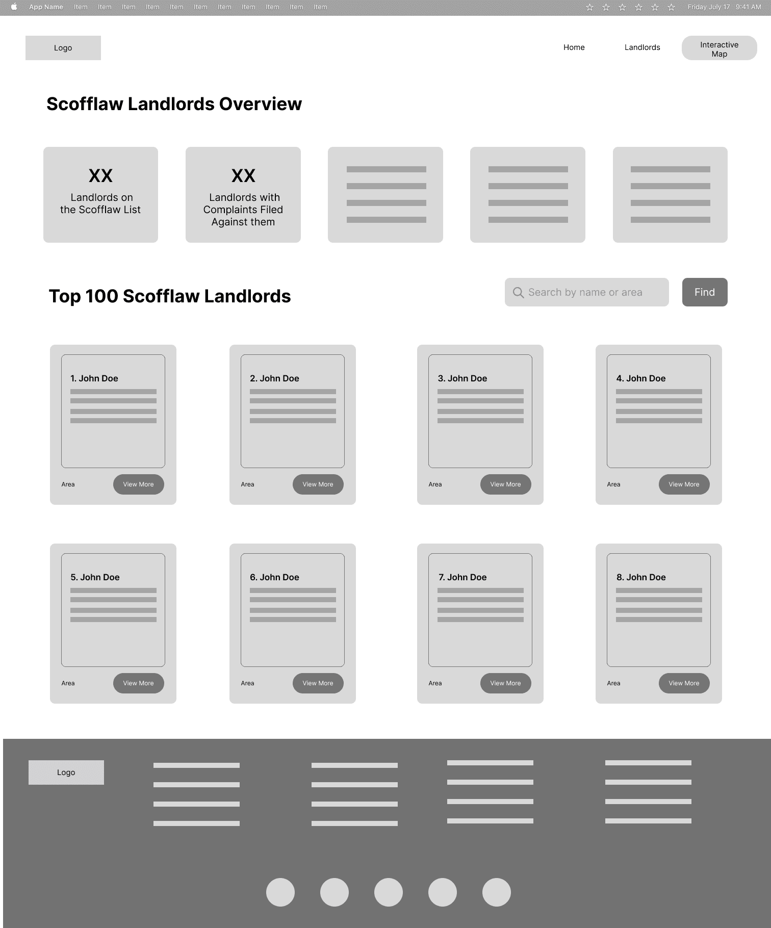
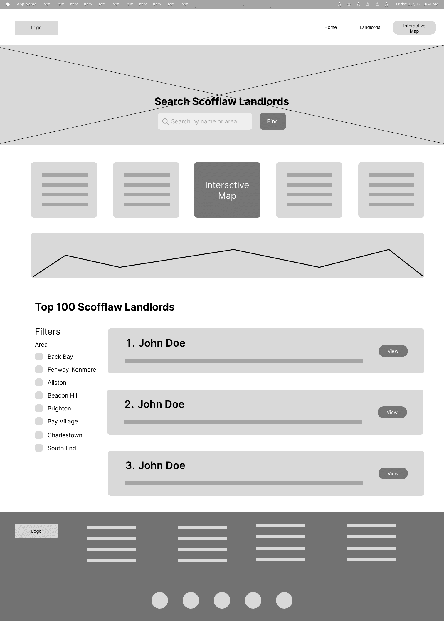
Once I had a rough idea of what kinds of functionalities we were looking for, I went ahead and drew some sketches (and converted them into lo-fi ones to present to the team).
I created three versions of the homepage to see how I wanted to visualize our data
Option 1: Overview + Landlord Cards
Option 2: Overview + Filters by area
Option 3: One page one landlord
The biggest roadblock
Once presenting the wireframes to the team, we found that none of these ideas would work.
Based on the data available, it would not be possible to perfectly match a single landlord with a single property. As a result, this made it difficult to make a landlord specific page since it wouldn’t even show the properties the landlord owned
Putting people in the forefront
Sometimes what we think is the best idea... may not be possible. Shifting gears, together with the team, we decided to do a property(street-address) first approach.
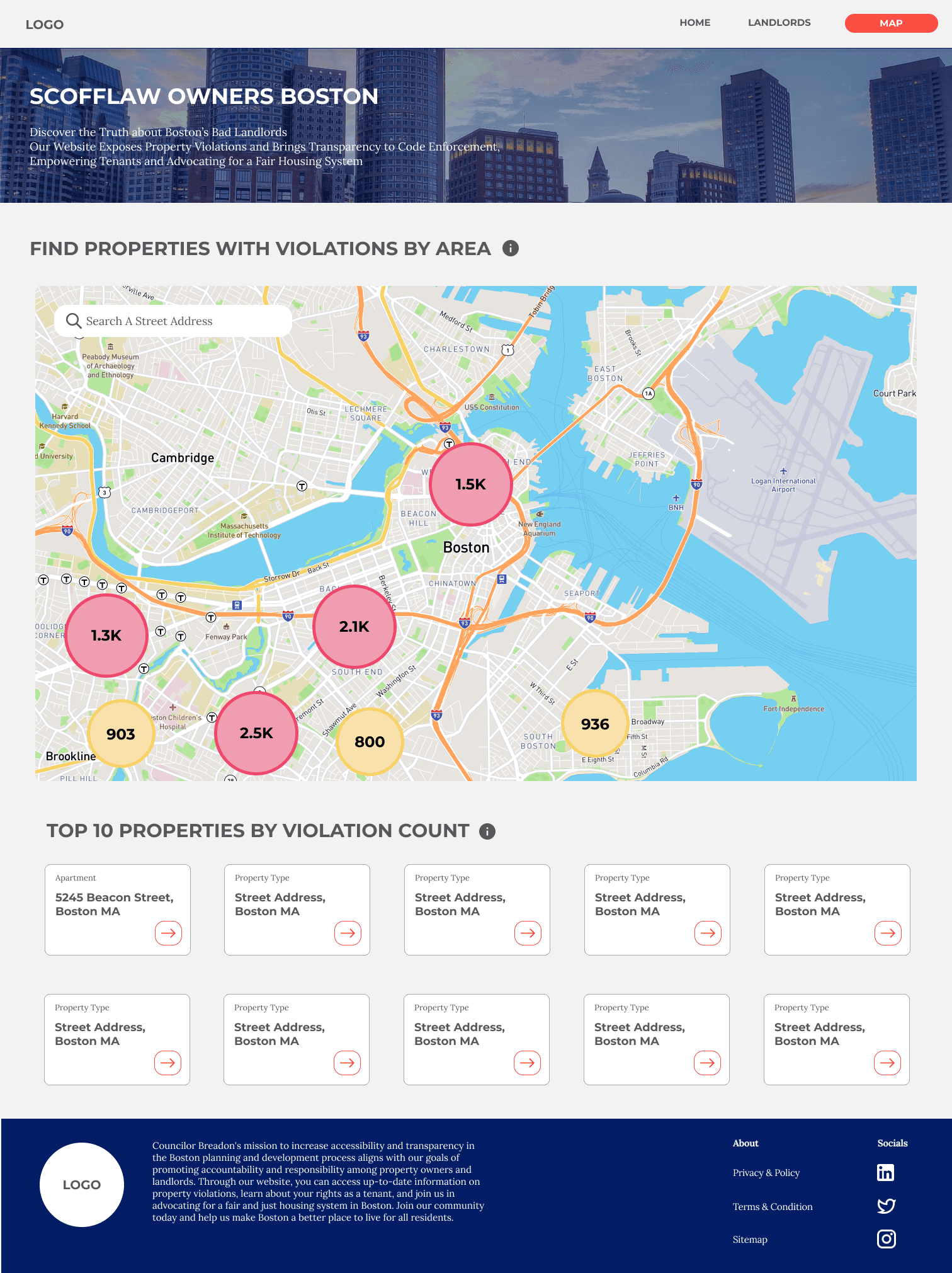
In discussion with the team, we wanted to merge the interactive map into the homepage so users could immediately search the street address of the property they wanted to find.
With the team feedback, I created an updated wireframe
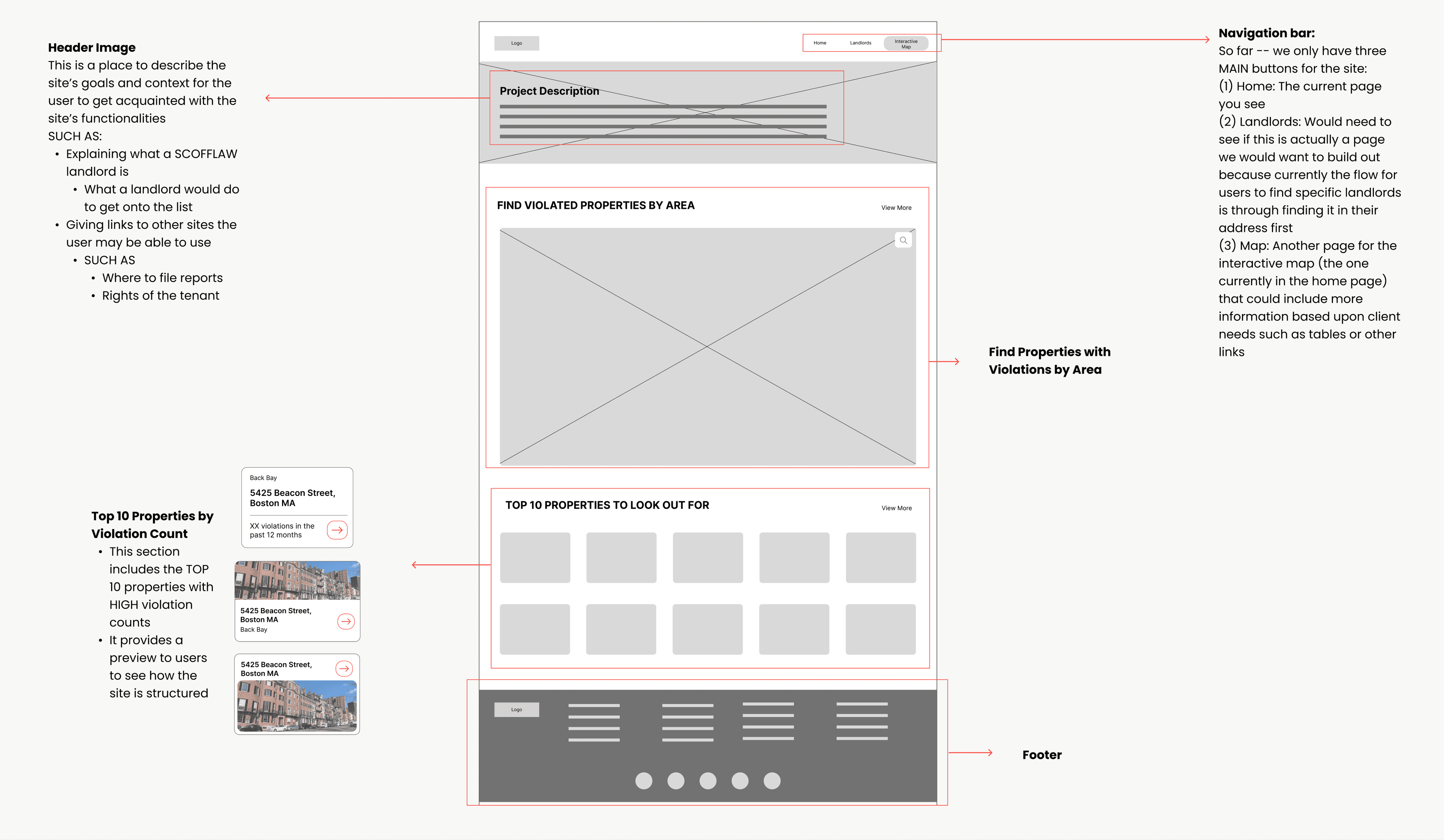
Focusing in on the map
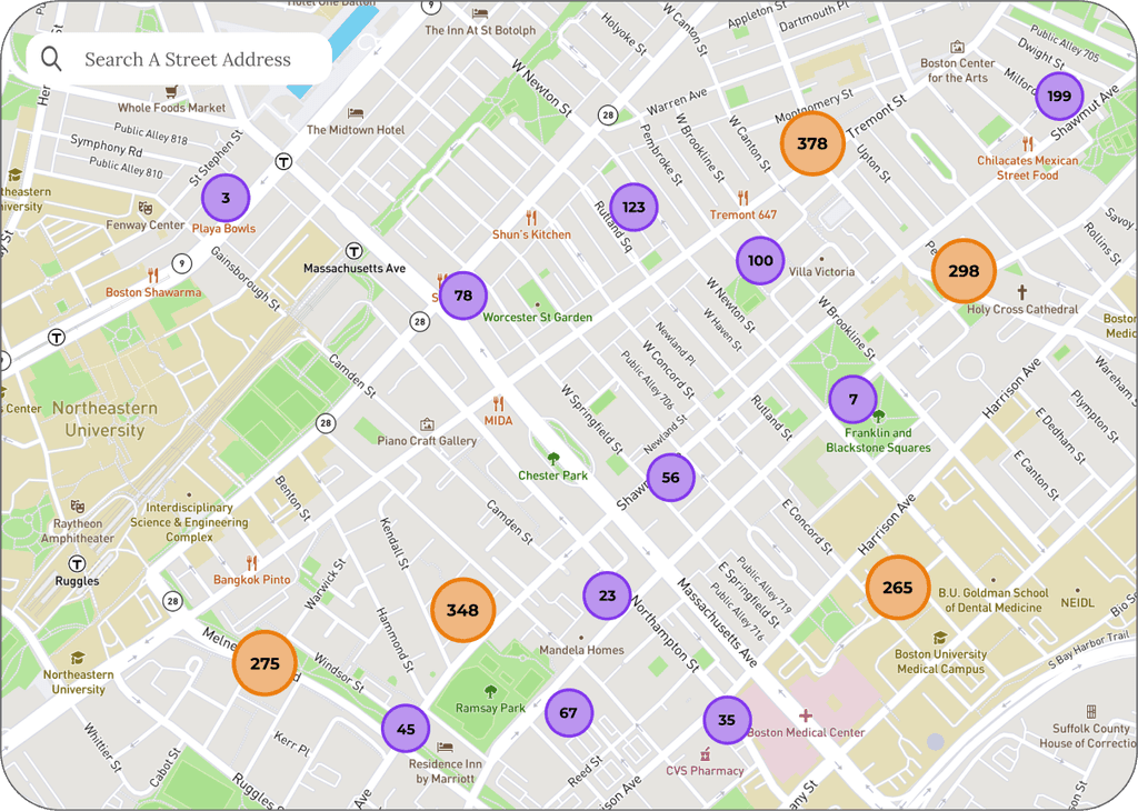
This is where it gets tricky -- the map contained all the data points from ALL the properties in Boston.
In short, we needed to figure out a way for users to easily comb through lots of data points and differentiate properties that had violations and properties without.
📈 How to easily comb through data in the interactive map?
Looking through multiple ways apps display maps, the option of aggregated bubbles was discussed -- this way users could press into the bubbles and zoom into the area they would like to see.
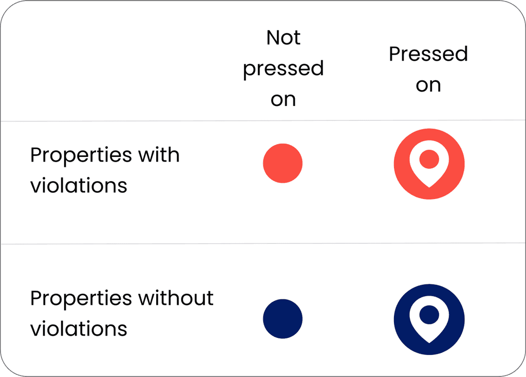
🏠 To differentiate properties (the ones with vs without violations)
Here’s where my style guide came in handy -- I was able to pick two different colors from our brand guide and assign them to either a property with violations or to a property without.
Press to enlarge 🔍
A Few Takeaways
🖥 Take into account data constraints
🗂 Keep Figma files organized and do NOT delete anything
By doing so, I realized that it greatly helped me communicate my ideas thoroughly during team meetings and kept everyone on track with my progress
